What were some of the larger trends in funding for transparency, participation, and accountability (TPA) in the first full year of the pandemic, 2020? And what does TAI-members funding represent at a wider international level? If you are intrigued to know more about the bigger picture around TPA funding and want to do some of your own analysis, then you came to the right blog.
In our previous blog, we shared a summary of TAI-members’ TPA-related grants data and shared a dynamic Power BI dashboard. We wanted to build on that and provide another way to look at funding trends.
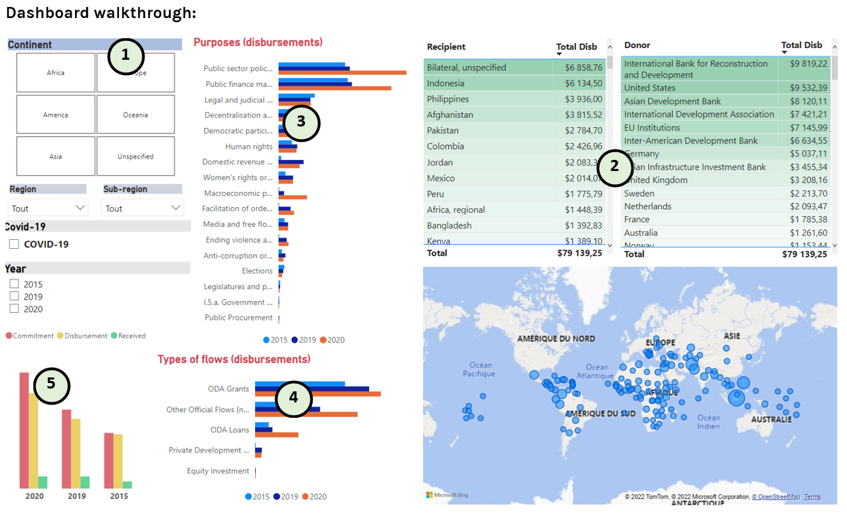
In this edition, we give a different shape to the OECD data on governance, civil society, and global TPA funding for 2020, 2019, and 2015 by creating a dynamic summary through Power BI. This draws on the April 2022 data release and shows data from the sector code for I.5.a. Government & Civil Society-general. You can explore this data yourself: more on how below.
Reminders:
Units are millions of United States dollars in nominal terms
The dashboard is based on reported disbursements
Years displayed are years of the disbursement, not the start of the project.
The data provided below was extracted from OECD stats.
*2025 UPADTED DASHBOARD WITH DATA FROM 2019 to 2023
1) Geographic coverage and map: Data presented is disaggregated geographically by countries, sub-regions, regions, and continents as provided by OECD. The default data is global. To focus on a specific sub-region, region or continent use the filters that appear in the top left frame. If you want to focus on a specific country, click on the country’s name in “Recipient” table.
The regions available include: Africa Regional, America regional, Asia regional, Caribbean and Central America, Europe regional, Far East Asia, Middle East, North of Sahara, South and Central Asia, South America, South of Sahara and “Unspecified”.
Sub-regions available include: Eastern Africa, Melanesia, Micronesia, Middle Africa, Polynesia, Southern Africa, and Western Africa.
The map provided is dynamic as shown in the different GIFs.
Note that all the blue points in the map are clickable and that you can use your mouse wheel to zoom in and out.
2) Funding data
The “Recipient” table describes countries or regions designated as benefitting from the disbursements listed. The “Donor” table lists which country, organization, or agency is providing funding and how much during the abovementioned period.
Countries and donors are clickable to focus on that funding flow as shown below.
3) Purpose of funding
The purposes are from the I.5.a. Government & Civil Society-general code. At TAI, we see many of these are related to TPA issues and inclusive governance. They include:
Public sector policy and administrative management
Women’s rights organizations and movements, and government institutions
Legal and judicial development
Facilitation of orderly, safe, regular, and responsible migration and mobile
Human rights
Democratic participation and civil society
Anti-corruption organizations and institutions
Media and free flow of information
Decentralization and support to subnational government
Public finance management (PFM)
Domestic revenue mobilisation
Ending violence against women and girls
Elections
Legislatures and political parties
Macroeconomic policy
Public Procurement
Government & Civil Society-general (when not designated to a specific purpose)
The different purposes are clickable and lead to a focused view, as shown below.
4) Type of funding
For ‘types of funding,’ we use flow types as categorized by the OECD:
Official development assistance (ODA) Grants
ODA Loans
Private Development Finance
Other Official Flows (non-Export Credit)
Equity Investment
As mentioned above, the categories are clickable and so are years. They lead to a focused view.
5) Disbursement
This dynamic chart provides a comparison between reports on what was committed, what was disbursed and what was received. This chart is also clickable and all the focused view elsewhere in the dashboard lead to a focused view in the funding amounts chart.