On the surface, international funding for governance areas increased significantly from 2021 to 2022: from over $26 billion to over $37 billion. But we've gone deeper into these numbers, and now you can also unpack the trends yourself in our latest funding data dashboard.
For the last four years, the Trust, Accountability, and Inclusion Collaborative (TAI) has been committed to sharing data trends on funding for transparency, participation, accountability (TPA), and democratic governance issues worldwide. You might remember our then Atlas Fellows Mehdi Bousnina and Baba Kankani presented two PowerBI dashboards using OECD data on governance and civil society for 2015, 2019, 2020, and 2021.
This year, we compare four consecutive years (2019, 2020, 2021, and 2022) in a more updated and user-friendly dashboard. We know this barely scratches the surface of the wealth of information on the OECD DAC data but, whether you're a researcher, policymaker, or simply an ardent data enthusiast, this interactive tool offers the opportunity to dive into the specifics of funding flows, compare trends across regions and sectors, and uncover the stories hidden within the numbers.
2025 UPDATED DASHBOARD WITH DATA FROM 2019 to 2023
Finding Exactly What You Want to Know
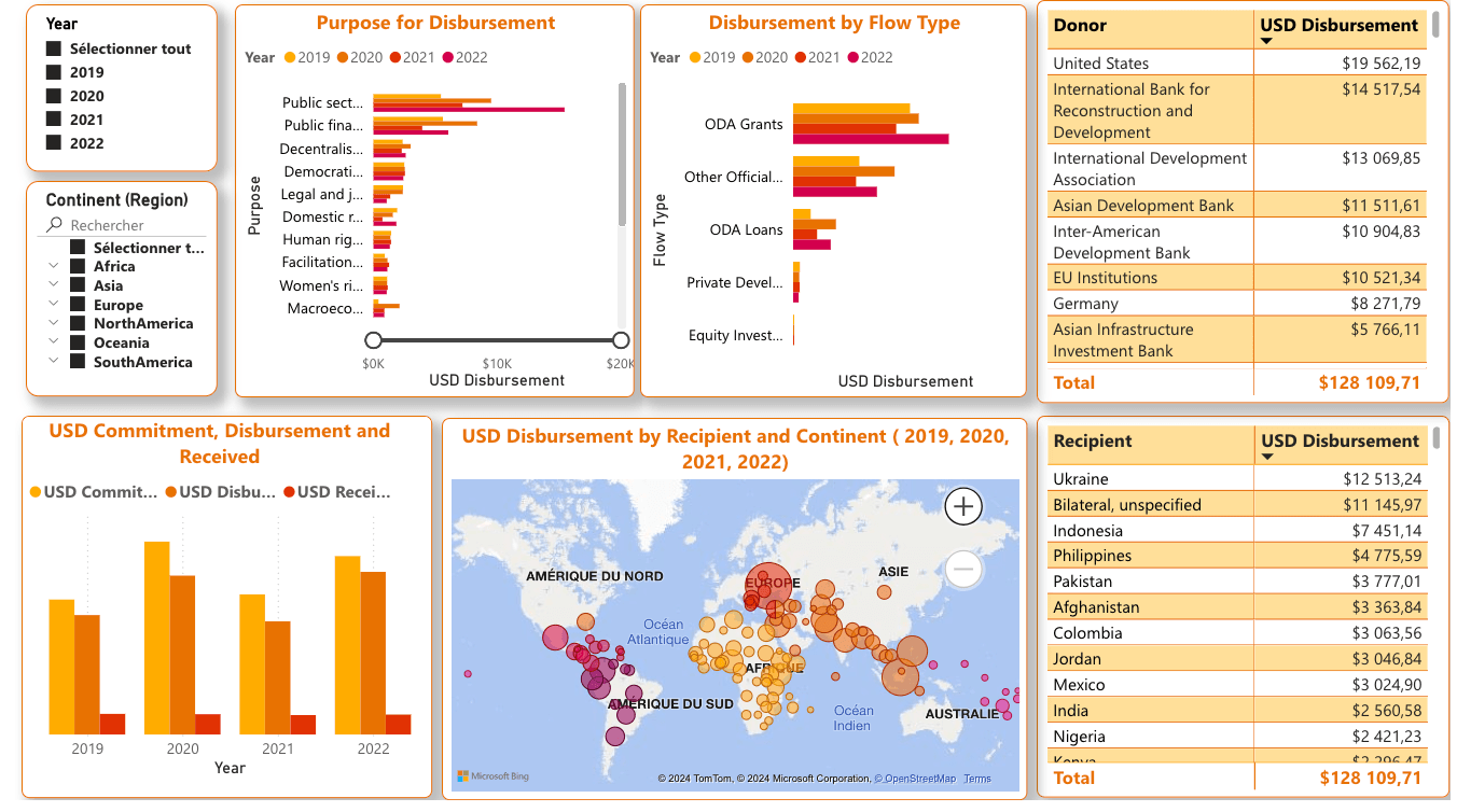
The first screen of our dashboard is the same as in previous years. It includes "Geographic and Temporal Filters" to tailor your exploration, whether you're interested in dissecting funding trends by continent, region, or individual countries. Our intuitive filters empower you to zoom in effortlessly on your area of interest.
The first graph, “Purpose of Funding” explores the multifaceted landscape of funding goals, ranging from human rights and legal development to media freedom and anti-corruption initiatives. Each purpose code serves as a window into the diverse array of issues intersecting with TPA concerns.
Users can also delve into the details of funding mechanisms, from ODA grants to private development finance (aka charitable giving) using the second graph: “Disbursement by Flow Type”.
The following two tables offer a “Recipient and Donor analysis” highlighting the top recipients and donors driving funding dynamics in 2022. From Ukraine's substantial funding influx to the pivotal roles played by international organizations and bilateral donors, users can track the flow of resources with accuracy.
Lastly, we offer a “Regional Analysis” to showcase the evolving landscape of sectors receiving funding all over the world. Where money is going? and what countries are receiving greater benefits from international funding? The user can witness the shifts in funding geographical allocations over time.
New Features
Unlike our previous dashboards, you now also have access to four new screens for deeper exploration.
On the second screen, you'll find totals for the amount of USD committed, disbursed, and received. Received funding is underreported, but we show it here to urge all reporters to do better! In the bar charts, you can dissect the information by year, as well as by purpose of disbursement and disbursement by flow type. Each of these charts can be expanded to fullscreen for better visibility of the figures.
The third screen displays data regarding donors and recipients. Each data point is clickable, allowing you to view information specific to each listed element. Both donors and recipients are organized in descending order based on the total amount donated or received.
The fourth screen showcases disaggregated content by locations on two maps: one with details of all countries where recipients are located, and another that shows totals by continents. All elements of each graph are interactive and contribute to filtering information for more effective use.
Additionally, at the top edge of all these additional screens, we have five general filters (year, continent, region, donor, and purpose) that allow users to consume information tailored to their specific needs.
Final Notes
Before you delve into our PowerBI dashboard and embark on your journey through the data, here are some crucial points to keep in mind:
Units: The figures displayed in the dashboard are in millions of United States dollars in nominal terms, also known as current dollars.
Type of Figures: Unless otherwise labeled, most figures represent gross disbursements, not net grant equivalents or commitments.
Data Source: The dashboard is based on reported disbursements, providing a snapshot of actual spending.
Year Representations: The years displayed correspond to the disbursement years, not the commencement of the projects.
Data Origin: The data provided in this dashboard was extracted from OECD stats in the spring of 2024, ensuring reliability and accuracy.
"Unspecified" Categories: Categories labeled as "unspecified" likely encapsulate funding that is not designated for a specific country or funds not yet disbursed to individual countries.
So, what are you waiting for? Immerse yourself in this data-driven journey, and let the numbers guide you through the intricate landscape of TPA and good governance funding. Who knows? You might just uncover the next groundbreaking revelation.
Want even more data fun with different views? Check out the OECD DAC’s dashboard, which uses different lenses. For any inquiries or further assistance, feel free to reach out to us at [email protected].
Happy data searching!